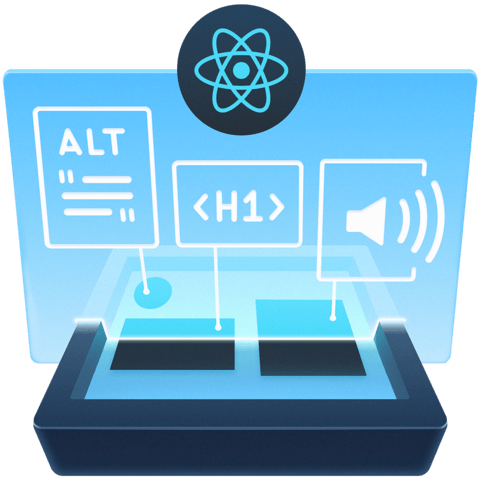
Use More than Color Alone to Convey Information in a Web Page


We should not use color alone as the only visual means of conveying information, indicating an action, prompting a response, or distinguishing a visual element. Users may not be able to see/understand the differences in color and require additional indicators.
Along with color, use additional indicators such as:
- typography
- shapes
- grids
- spaces
- and/or allocate more weight to important elements
References:
- http://www.particletree.com/features/interfaces-and-color-blindness/
- https://www.smashingmagazine.com/2014/10/color-contrast-tips-and-tools-for-accessibility/
Instructor: [00:01] Here's a Web page that previously had color contrast issues, but they've all been resolved. We can see our console is clear of any findings from ReactX.
[00:12] If we run X again, we now have no issues with color contrast. Everything is crisp and clear. If we use our Chrome High Contrast browser extension and check each of the modes, everything is still easy to read and see in all of the modes. Notice the tabs when we select a tab, we can tell which one is selected.
[00:40] Let's see what this looks like in Windows high contrast mode. We can see here that we still can't tell which tab is selected. I can click on each of these tabs and nothing changes visually to indicate which one has been selected, so we still need to fix that.
[01:09] The problem here is that our design is trying to use color alone to convey meaning. With certain high-contrast tools, like the one we're looking at right now, color is removed, or for certain users who have issues with color and they can't see those differences, we need to alter our design to convey the meaning without relying on color alone, so let's go fix that.
[01:34] Now we've changed our design so that instead of using a pill design for each tab, we're using a tab design. Now you can clearly see which tab is selected and which is not.
[01:48] If we go back to Chrome on the Mac, we can see that this new design works just fine here as well. Everything is very clear. You can tell the difference between the selected tab and the hover state.
[02:04] If we use our High Contrast browser extension and check each mode, each of these works just as well. This is a solution that works in all high-contrast modes on all operating systems and browsers.
Member comments are a way for members to communicate, interact, and ask questions about a lesson.
The instructor or someone from the community might respond to your question Here are a few basic guidelines to commenting on egghead.io
Be on-Topic
Comments are for discussing a lesson. If you're having a general issue with the website functionality, please contact us at support@egghead.io.
Avoid meta-discussion
Code Problems?
Should be accompanied by code! Codesandbox or Stackblitz provide a way to share code and discuss it in context
Details and Context
Vague question? Vague answer. Any details and context you can provide will lure more interesting answers!